Olivier’s Theme 3.0 ⬩ User Guide
Olivier’s Theme is an Obsidian theme focused on legibility, calm color palettes, and a clear separation between reading and writing.
This guide explains how to configure the theme, from global interface settings to typography, color palettes, and per-note cssclasses. It assumes you already know the basics of Obsidian and want to tune your workspace efficiently.
What’s new in version 3
Version 3 brings a broader and more structured customization system.
- A full OKLCH color engine for more predictable hue and contrast handling. 1
- Improved palettes with calmer accents and better balance.
- New palettes, including one with access to the full 360° hue range.
- Adjustable color intensity in most palettes.
- More layout options for Bases headers, table width, and Bases width.
- Refined vertical rhythm and new typographic separators.
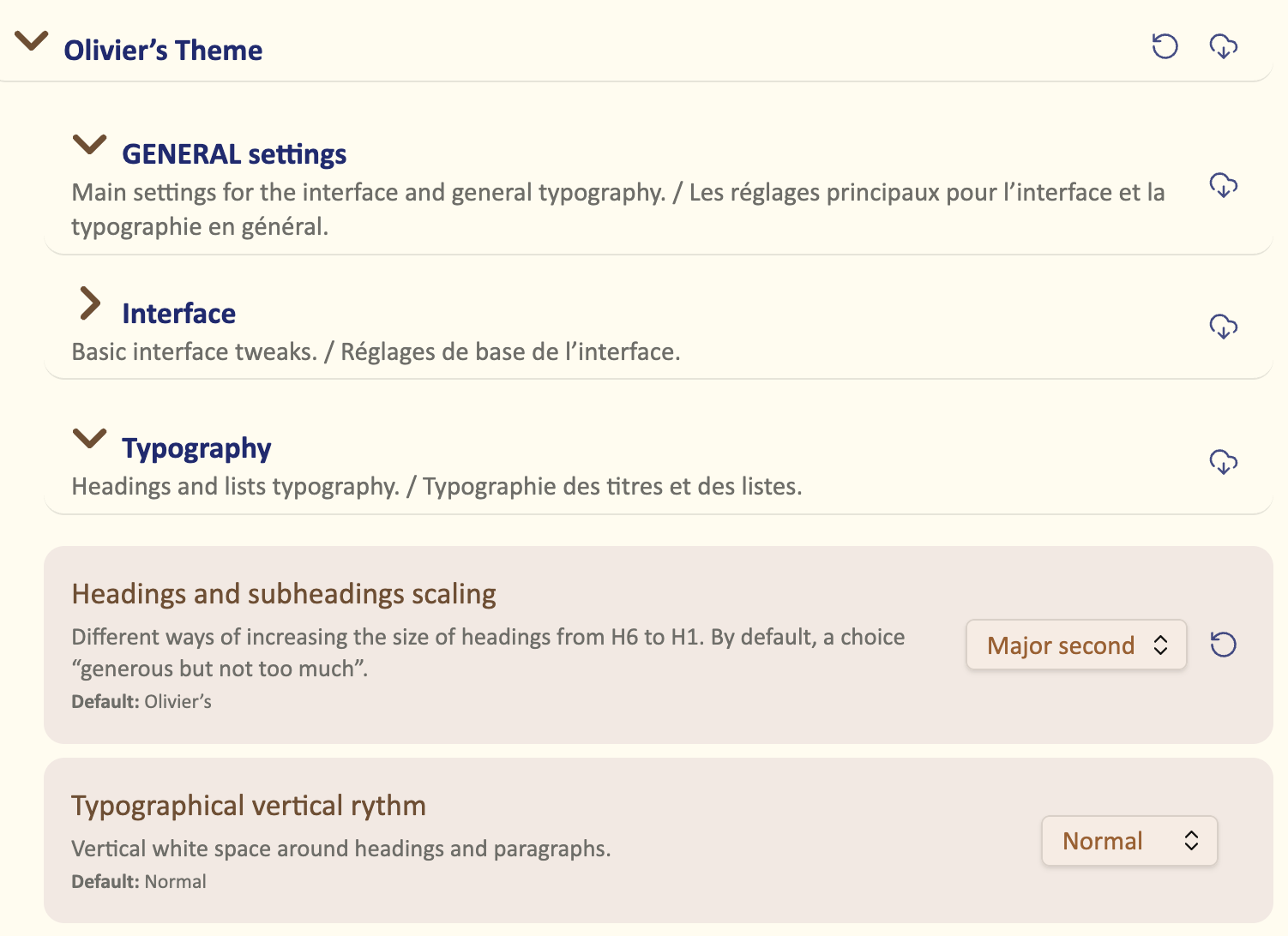
- Reorganised settings, with clearer sections for Interface, Typography, and Kanban.
- More CSS classes for note-level customization.
It also includes many smaller visual refinements and clean-ups across the theme.
Before you start
To use all the options described here, you need:
- Obsidian 1.5 or later.
- Olivier’s Theme installed and active.
- The Style Settings plugin enabled.
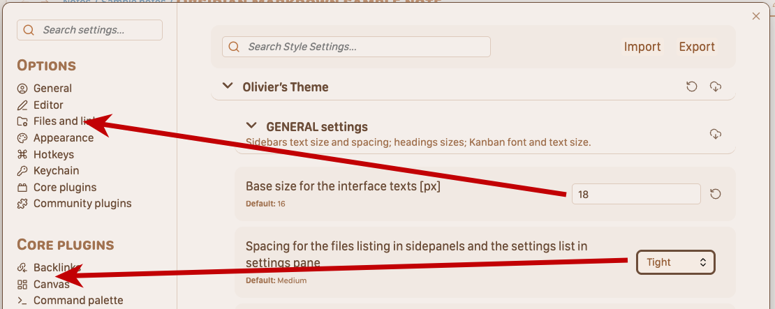
All theme settings are located under Settings → Appearance → Style Settings → Olivier’s Theme.
If some Obsidian terms feel unclear, see the Glossary.
Coverage of settings
This documentation is organised around the main sections of the theme and is meant to cover all user-facing options available in Style Settings, plus the main note-level cssclasses.
Some pages are fully illustrated, while others are still being expanded. Even when screenshots are missing, the goal is to document what each option does and when it is useful.
How to use this guide
You do not need to read everything in order.
- Go to General for interface, typography, and Kanban settings.
- Go to Light mode colors to choose a palette for light mode.
- Go to Dark mode colors if you want a different palette in dark mode.
- Go to Reading mode for a more book-like reading experience.
- Go to Writing mode to tune your editing environment.
- Go to CSS classes reference for the full list of available cssclasses.
- Go to Niceties & cssclasses guide to learn how to use cssclasses in practice and apply note-level refinements.
- Go to the Glossary for definitions of key Obsidian terms used in this guide.
If you want to…
- Make the interface larger, denser, or easier to read: start with General.
- Choose the overall color atmosphere of the theme: see Light mode colors and Dark mode colors.
- Fine-tune links, highlights, and inline text colors: see Text colors.
- Improve long-form reading comfort: see Reading mode.
- Improve writing comfort in Live Preview or Source mode: see Writing mode.
- See the full list of available cssclasses: see CSS classes reference.
- Learn how to use cssclasses for note-level tweaks or special layouts: see Niceties & cssclasses guide.
Quick path ⬩ 5-minute setup
The default settings stay close to standard Obsidian. A few adjustments can make the theme much more comfortable on your current screen.
This section only covers the settings that usually make the biggest difference first. For full explanations, use the detailed pages.
1. Adjust the interface
Open GENERAL settings > Interface and start with:
- “Base size for the interface texts (px)”
- “Spacing for the files listing”
These two settings already change how comfortable the whole interface feels in everyday use.
2. Adjust the main typography
Open GENERAL settings > Typography and start with:
- Heading scaling, to control the visual hierarchy from H1 to H6.
- Vertical rhythm, to make the text feel tighter or more spacious.
3. Choose your color palette
Pick a palette in Light mode colors.
In most cases, this is the most effective way to give the theme its overall atmosphere. If needed, you can then choose a different palette for dark mode.
4. Improve reading comfort
Open READING mode and focus first on:
- Body text size
- Line height
- Line length
These three settings define most of the reading experience. If you often work with tables or Bases, you may also want to adjust their presentation.
5. Improve writing comfort
Open WRITING mode and adjust the main text settings so editing feels as comfortable as reading.
If you mainly write in Live Preview, focus on the options that affect text size, spacing, and visual calm while editing.
6. Add note-level refinements when needed
Once the global settings feel right, you can use cssclasses for special cases.
This is useful for notes that need a different layout, a cleaner look, or specific visual adjustments without changing the whole theme.
-
OKLCH means “ok Lightness Chroma Hue”. It’s a CSS color system designed to handle colors in a way similar to human perception. It’s inspired by the Munsell color system. ↩