General settings
If needed, see the Glossary for short explanations of common Obsidian terms such as panes, tabs, sidebars, status bar, Canvas, and Properties.
The GENERAL settings group controls the theme-wide options that shape the interface before you fine-tune Reading mode, Writing mode, or colors.
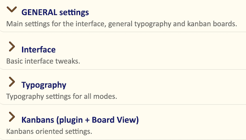
In version 3, these settings are organised into three sections:
- Interface — global UI behaviour, mode indicators, UI text size and spacing, labels, and structural elements.
- Typography — heading scaling, vertical rhythm, separators, and other text-related choices.
- Kanban — the main visual settings for Kanban boards, including typeface, text size, and lane width.
Interface
The Interface section controls the global appearance and behaviour of the Obsidian workspace: UI text size, sidebar density, tabs, pane indicators, Properties, embeds, lightbox, status bar, and Canvas.
For full descriptions and screenshots, see Interface.
Typography
Headings and subheadings scaling
Olivier’s Theme already gives headings a clear visual hierarchy through spacing, rules, weight, and style. This setting controls how much their size increases from H6 up to H1.
Several presets are available:
- None — all headings use the body text size; hierarchy comes only from spacing and styling.
- Minor second / Major second / Minor third / … — progressively stronger typographic scales.
- Olivier’s — the default balance, clear without being exaggerated.
On smaller screens, a modest scale often works better. On large displays, a stronger scale can make long notes easier to scan.
A simple way to choose:
- Open a long note with several heading levels.
- Try different scaling presets.
- Stop when the hierarchy feels clear at a glance, without making headings too dominant.
Typographical vertical rhythm
This setting controls the overall vertical spacing between headings, paragraphs, and block elements.
A tighter rhythm shows more content on screen. A looser rhythm creates a calmer, more spacious page. Bear reproduces the regular spacing style familiar from the Bear editor.
Lists: Text size stepping down
When this option is off, all list levels use the same text size as the body text.
When it is on, deeper list levels become slightly smaller. This helps long or deeply nested lists stay visually lighter without hurting readability.
Lists: vertical spacing, line spacing
This setting controls the spacing between list items and the line height inside multi-line items.
Normal keeps lists close to the surrounding text. Tight fits more items on screen, which can be useful for long checklists or dense nested lists.
Lists: Indenting
This setting controls how far bullets, numbers, and nested list levels are indented.
Normal matches a classic document layout. Wide and Generous make nested structures easier to read, especially on larger screens or in deeply nested lists.
Text separators
This setting lets you choose between eight styles of horizontal separators, from a discreet line to a more decorative fleuron.
For a fuller overview, see Horizontal rulers. These separators can also be applied note by note with the CSS classes reference.
Suppress line wrapping within code blocks
When this option is on, long lines inside code blocks do not wrap.
This is often better for code samples, terminal commands, and configuration files, because each line stays intact and can be scrolled horizontally if needed.
When the option is off, code blocks wrap like normal text. That can be more comfortable on narrow screens, but sometimes less practical for real code.
Kanbans (plugin + Board View)
Kanban – General font
This setting defines the font used for column titles and card text in Kanban boards.
You can keep it aligned with your main text font for a more consistent interface, or choose a different font if you want Kanban boards to have a more distinct character.
Kanban – Size of the cards text (px)
This setting controls the text size inside Kanban cards.
Increase it if your boards feel cramped or hard to read. Decrease it slightly if you use dense boards and want to fit more information on screen.
Kanban – width of the lanes (em)
This setting applies to the Board View plugin, not to the original Kanban plugin.
It controls the width of Kanban lanes in em units. Narrower lanes let you see more columns at once, while wider lanes make long card titles and descriptions easier to read.